☰
Esplorare
registrati
Iscriviti
Caricare
×
Scaricare
senza categoria
Ritorno alla base Back to Base
Diapositiva 1 - il treno informatico
Centro Direzionale Umberto Forti
Presentazione di PowerPoint
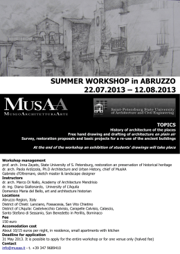
SUMMER WORKSHOP in ABRUZZO 22.07.2013 – 12.08.2013
Corso di laurea magistrale in Pianificazione territoriale, urbanistica e
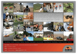
Team Building 2012 Briefing Descrizione attività
FUTURO E UTOPIA